The challenges of building a Churn model

- marketing
- November 7, 2022
- Categories: Artificial Intelligence
- Tags: Customer Churn
What is Churn?
Churn (sometimes called attrition), in its broadest sense, is the state in which individuals or items moving move out of a collective group and is one of two primary factors that determine the steady-state level of customers a business will support.
“This is why it comes not as a surprise that, as customer retention is one of the primary KPIs for companies in any industry, a bad customer experience that would lead to customer churn to competition, is a challenge that needs to be confronted all the time.”
Why do we do churn prediction?
This is why churn prediction has turned into one of the main challenges the companies have to face, with its primary goal being to predict a list of potential churners, so that providers can start targeting them by retention campaigns.
Predicting that a particular customer is at high risk of churning and being able to do something about it, is a huge advantage for a company and a potential money saver, especially for companies with large customer acquisition costs.
Deep dive: Churn prediction system for retail
The churn rate is very important in the retail industry, as it provides clarity on the quality of the business, shows customer satisfaction with the product or service, and allows for comparison with competitors to gauge an acceptable level of churn.
To better assess our approach to the churn prediction model, we set the following conditions
-the customer churn predictive model was set to predict the churn on either 1,3 or 6 months in advance
-the dataset was to be sliced into two parts, with the first one containing all history transactional data that we use to extract features, and the second one, containing the labels for the evaluation of the model, based on a selected period that we want to predict the churn.
The dataset model can be depicted below, with the exact date that we slice our dataset, being called the cut-off date.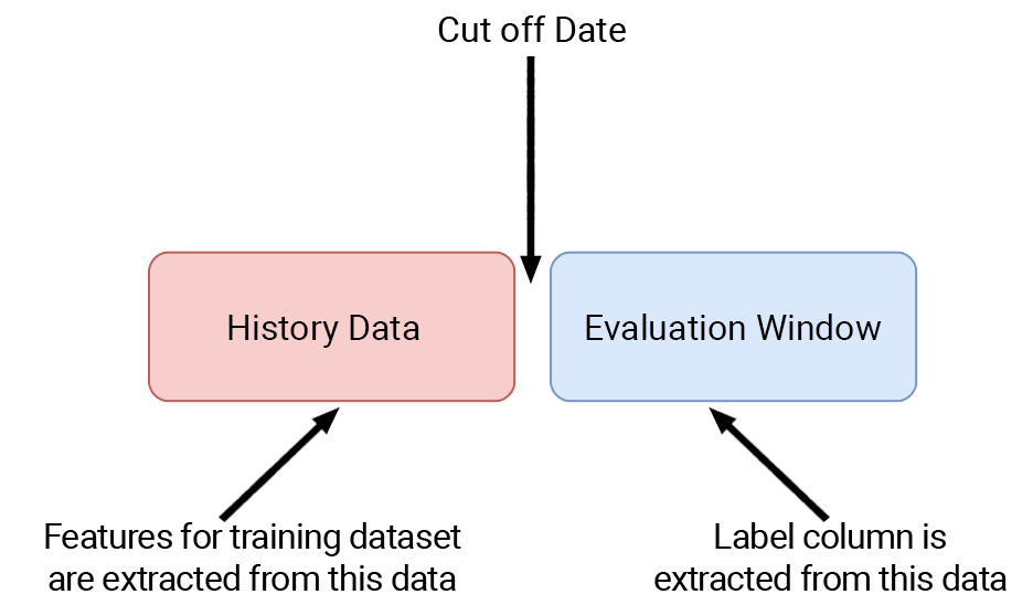
Following an analysis based on the business insights from our team, we decided that the interval for the evaluation window for this industry and the customer, that is predicting that a customer may or may not churn, should be best set at six months,
By choosing the churn period to be 6 months, the average transaction frequency for our customer database is determined to be ~2 (=12 / 6).
Regarding the dataset model, we identified the 3 following approaches, with respect concerning to the evaluation window:
- As an evaluation window, we take the last six months and the rest historical data. That was the first idea, but it carried the risk that, if there is a significant number of customers who haven’t made purchases in a long time, the model would become biased and would automatically assume that customers who hadn’t bought for a long time were churners.
- The second idea was that we would have the last 6 months as an evaluation window, and for feature extraction, we would take the preceding interval, but we would cut off the interval, from the end of the period to the user’s last purchase by adding a random number of days as a buffer in front of it. This truncation would be foreseen for those who had not purchased in the last few months.
- The third idea was for the evaluation window to be shiftable, i.e. instead of the last six months, it would shift backward in time for customers who had not made a purchase. This would work as follows, by first cutting off the last six months, then checking which customers did not have made a purchase several months into the new period, and applying the cut-off effectively.
Following simulations, it was found that the best approach for dataset creation was the third one.
Having determined the dataset model, it is now time to dive into the model implementation.
Data and feature engineering
Transactional, demographics, and campaign data will be used to extract the features for each customer, to be effectively stored according to the following table, with each row representing a distinct customer and each column representing a feature.
Using the data available, we extracted the features for each customer below:
- Total Revenue (sum): Amount of money spent during the period of analysis.
- Total Transactions (transactions_count): number of transactions carried out during the period of analysis.
- Days from last transaction (days_inactive)
- Days on board (days_on_board): time that a customer is a member
- Average basket (avg_basket): Average amount of money the customer spends on each purchase
- Gender (gender)
- Age (age)
- Favorite store (Boolean) (fav_store): if a customer prefers to buy from an E-shop or a physical store
- Different stores where a customer made transactions (store_counts)
- The average revenue per month (monthly_avg): the average amount of money that each customer spends per customer per month.
- Allow Viber notifications (Boolean) (allow_Viber)
- Allow email (Boolean) (donotbulkemail)
- Allow push notifications (Boolean) (allow_push_notifications)
- Percentage of revenue per product category (the name of each product category): what percentage of the total revenue of the customers is spent on each product category?
- Percentage of revenue per season (winter_perc, spring_perc, summer_perc, autumn_perc): what percentage of the total revenue of the customers is spent on each season (winter, spring, summer, autumn)
- Percentage of products a customer bought on discount(discount_product_perc)
- Average days between transactions (avg_days_between_transactions): The average number of days that a customer makes a transaction.
- Churn factor (churn_factor): It is a metric that shows how possible it is for a customer to churn. It is described more in detail below.
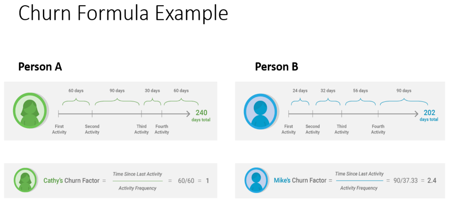
The churn Factor is one of many features we use for our classification (churn prediction) task.
But how is it generated?
Let’s take, for example, Person A (Cathy) and Person B (Mike). They have both made 4 transactions in total, but their activity frequency is different, as well as their time since their last activity.
For Cathy, the activity frequency is 60 (that means that Cathy makes a transaction every 60 days on average) and for Mike, the activity frequency is 37.33. Thus, we would say that Mike is a more frequent buyer than Cathy.
Cathy’s time since the last activity is 60 days. So we expect Cathy makes a new transaction, day in and day out (her activity frequency is also 60 days). For Mike, the story is different, as his time since his last activity is way bigger than his activity frequency. That means that Mike should have made a new transaction, but he hasn’t.
Thus, Mike has a bigger churn factor than Cathy.
Classification
Train and test set to split. Which we used as a test set.
To make the evaluation process more precise, we did not use a usual train-test split for our dataset. We preferred to use a custom test set of customers that had made a single transaction within the last 12 months(36334 customers or ~13% of the total dataset). This way, we would avoid testing the model on customers that had not made a transaction for a long period, and on the other hand, evaluate its performance (see the quality of its predictions that an active customer will (or will not) make a transaction in the next 6 months). The value counts for the train and test set as shown below:
y_train | y_test | |
|---|---|---|
1 | 181723 | 26946 |
0 | 46154 | 9388 |
Reactivated customers, why they exist.
In this stage of classification, we should take a quick look at our approach to the churn prediction problem. From the definition, we are trying to predict which customers will not make a transaction in the next 6 months. And that is the way we created the target label for our dataset (by looking at which customers made a transaction 6 months after their cutoff date and defining a binary label).
Although, there will be some customers that have not made a transaction 6 months after their cut-off date, but will make a transaction after the period of the 6 months. We call these customers “reactivated customers”, because, even though they will not purchase a product for 6 months after their cutoff date, they may make a transaction after this period
For example, Mark bought something in March 2021, did not make a transaction for the next 6 months (April 2021 – October 2021) but made a transaction in November 2021. While our model may have predicted that Mark would not make a transaction 6 months after March 2021 (our model was right), Mark still made a transaction after the timespan of 6 months, and thus our model’s prediction was in vain.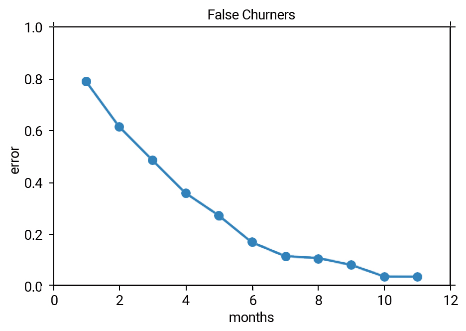
The above graph shows us the percentage of reactivated customers in the dataset, depending on the number of future months we use in our approach. As we select more months, the reactivated customers are decreasing (e.g the prediction will be more accurate if we select >6 months, thus fewer reactivated customers).
Classifiers comparing
For the classification needs, a comparison of 5 classifiers was made to find the model that best suits the churn prediction problem. These were:
- Random Forest
- Gradient Boosting Classifier
- Adaboost
- Catboost
- Logistic Regression Classifier
The metrics that were used to evaluate the models’ performance were the AUC Score, Accuracy, Recall, Precision, and F1 Score.
And their comparison can be shown in the table below:
AUC Score | Accuracy | Recall | Precision | F1 Score | |
|---|---|---|---|---|---|
Random Forest | 0.83 | 0.80 | 0.87 | 0.97 | 0.80 |
Gradient Boosting | 0.82 | 0.74 | 1.00 | 0.74 | 0.85 |
Adaboost | 0.85 | 0.81 | 0.84 | 0.82 | 0.87 |
Catboost | 0.87 | 0.83 | 0.92 | 0.86 | 0.88 |
Logistic Regression | 0.82 | 0.80 | 0.94 | 0.82 | 0.87 |
The best performing algorithm on most metrics was the Catboost Classifier.
Alongside the ML algorithms that were tested to assert the churn prediction problem, various performance-enhancing techniques were used to boost the algorithms (such as feature selection, scaling, and normalization). Although, as we did not observe any significant performance boost, we do not discuss them further.
Metrics
The metrics that were used to evaluate the classification were:
- Accuracy
Accuracy is not a very precise metric for binary classification. It is easy to get a high accuracy score by simply classifying all observations as the majority class. For example in our case, by classifying all customers as churners we can get an accuracy of over 0.7.
- AUC Score
ROC AUC score is equivalent to calculating the rank correlation between predictions and targets. From an interpretation standpoint, it is more useful because it tells us that this metric shows how good at ranking predictions your model is. It tells you what is the probability that a randomly chosen positive instance is ranked higher than a randomly chosen negative instance. However, it should not be used for imbalanced datasets as the intuition is the following: the false positive rate for highly imbalanced datasets is pulled down due to a large number of true negatives. 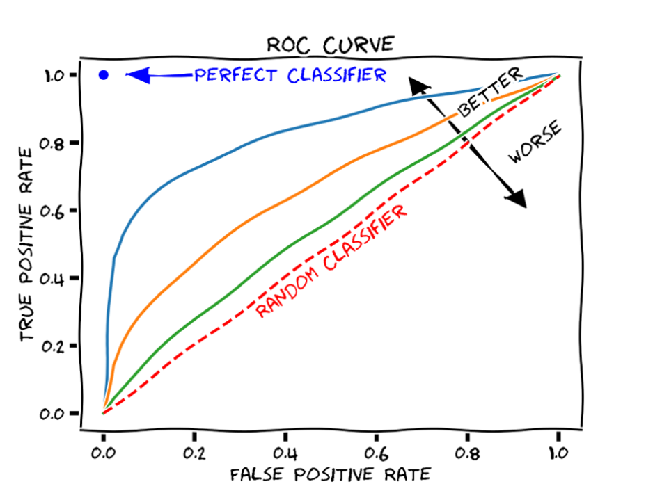
3.Recall 
Recall or True Positive Rate (TPR) measures how many observations out of all positive observations have we classified as positive. It tells us how many fraudulent transactions we recalled from all fraudulent transactions. In our case, it is extremely valuable, as we are trying to minimize false negatives and thus maximize recall.
- Precision

Precision or Positive Predictive Value measures how many observations predicted as positive are positive. Taking our churn prediction example tells us what is the ratio of transactions correctly classified as churn. When you are optimizing precision you want to make sure that people that you put in prison are guilty.
- F1 Score
It’s the harmonic mean between precision and recall. F1 Score is a valuable metric for ML models, especially for binary classification. 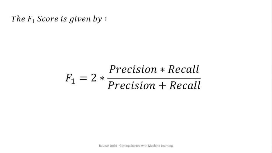
Plots and explanations
Feature Importance
Feature Importance refers to techniques that calculate a score for all the input features for a given model — the scores simply represent the “importance” of each feature. A higher score means that the specific feature will have a larger effect on the model that is being used to predict the target variable – in our case whether the customer will or not churn. 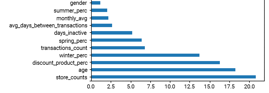
As we can observe, the number of different stores (store_counts), the age, the percentage of discount products the customer has bought, etc. are some of the most “important” features of our model.
An even more insightful way to look at feature importance is by generating the SHAP feature importance plot.
SHAP feature importance is an alternative to permutation feature importance. There is a big difference between both importance measures: Permutation feature importance is based on the decrease in model performance. SHAP is based on the magnitude of feature attributions. SHAP plots help us distinguish which features are important by observing the features’ value magnitude – in addition to their absolute importance values.
For example, a low number of store_counts (or the number of different stores a customer has visited) or a high age value are some examples of high importance(is significant for the model to predict the customer as a “1” or a churner). 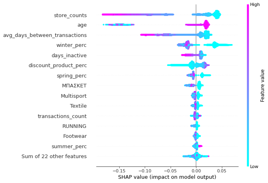
Probability Distribution
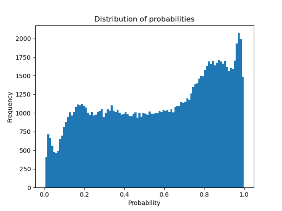
When a Machine Learning model is deployed in production, it is important to assess to which extent we can foresee insights from the model. A nice way to approach the churn prediction task is to take a look at the probability distribution chart. This chart shows how the model’s prediction probabilities are distributed. For example, a customer with a churn probability above 0.5 will classify as “1” as per the model. However, it is different when a customer is given a 0.55 churn probability and when another customer is given a 0.95 probability. The second one is more probable to churn and thus we treat him differently.
By taking into account the churn probability, we can filter the model’s predictions more appropriately, and anticipate different treatments for those customers with high churn probability.
What is the impact of the model on numbers?
Now that it is explained how the data is sourced and the churn target is created (which is one of the most challenging parts so far, we can discuss how this machine learning model will be used in the business. Read the below diagram from left to right:
- A model is trained on customer churn history (event period for X features and performance window for target variable).
- Every month active customer base is passed onto Machine Learning Predictive Model to return the probability of churn for each customer (in business lingo, this is sometimes called a score of churn).
- The list will be sorted from highest to lowest probability value (or score as they say it) and the customer retention teams will start engaging with the customer to stop the churn, normally by offering some kind of promotion or gift card to lock in a few more years.
- Customers that have a very low probability of churn (or essentially model predicts no churn) are happy customers. No actions are taken against
Standard metrics and model impact metric.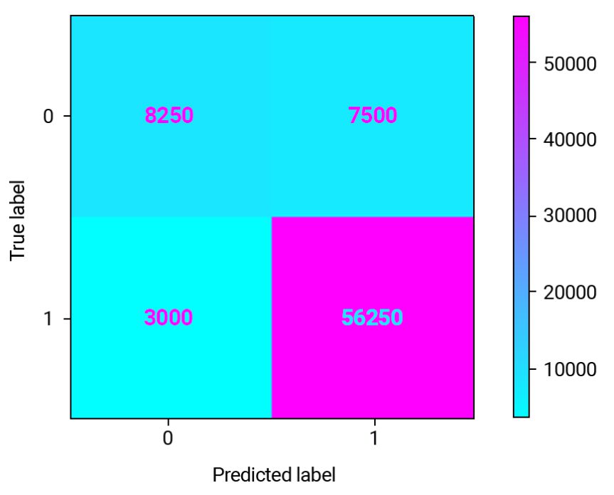
This confusion matrix is on a subset of the customer database for our retailer company customers which include 75000 rows. We have 56250 True Positives (75%) — these are the customers which will probably churn in the next 6 months and for which we will be able to extend their lifetime value. If we wouldn’t predict, then there was no opportunity for intervention.
We also have 7500 (10%) False Positives where we will lose money because the promotion offered to these customers will just be an extra cost.
8250 (11%) are True Negatives (good customers) and 3000 (4%) are False Negative (this is a missed opportunity).
So far we have trained multiple models to select the best model giving the highest F1 Score, followed by tuning the hyperparameters of the best model to squeeze a little more performance in terms of F1 Score. However, the best F1 Score doesn’t necessarily translate into the best model for business.
In a churn model, often the reward of true positives is way different from the cost of false positives. Let’s use the following assumptions :
- $50 voucher will be offered to all the customers identified as churn (True Positive + False Positive); We chose the 50 value as it represents the average basket for our customer database)
- If we can prevent the churn, we will gain $200 in customer lifetime value (the average CLV for our customer database)
NOTE: The values of the assumptions made above are indicative and were made to explain the actual model impact.
Using these assumptions and the confusion matrix above, we can calculate the $ impact of this model:
Description | Customers | Value | Total |
|---|---|---|---|
True Positive | 56250 | CLV = 200 € | € 11,250,000 |
True Positive + False Positive | 63750 (56250 + 7500) | Voucher = 50 € | € 3,187,500 |
Profit € 8,062,500 |
Although it’s a good model, it’s not a business-smart model.
It is doing a pretty good job compared to having no model at all, but if we want a model that maximizes the business value, we will have to train, select, and run optimizations using business metrics (like the metric we mentioned above) instead of any conventional metric like F1 Score or Accuracy.
We managed to increase profit with a model that does 2% less in AUC than the best model.
How did this happen?
Well, for starters, the F1 Score or any other out-of-the-box classification metric (Accuracy, Recall, Precision, AUC, Kappa, etc.) is not a business-smart metric, so it does not take into account the risk and reward proposition. Adding a custom metric and using it for model selection or optimization is a great idea and the right way to go with.
Source:
https://towardsdatascience.com/predict-customer-churn-the-right-way-using-pycaret-8ba6541608ac